Overview
I am a product designer in the Product Design team at YOOV. I was responsible for designing interface for several YOOV products by means of ux methodologies. The digital products that I have been involved include YOOV WORK (an HR management system), YOOV EAT (a POS system), YOOV PLUS (a No-code platform), and YOOV.com (the official website).
Background
The YOOV WORK HR management system manages attendance, rostering, leave, payroll, and employee records. The system is available in webapp and app version (namely IOS, Andriod, AppGallary and APK). The webapp system is designed for admin while the app version is designed for admin and general users (e.g. employees). For example, admin can arrange his employees’ rostering schedule on webapp while general users can view the arranged schedule on their app.
It has been developed to version 3.6.0 and will update continuously based on user's feedback and product roadmap.
Problem
Currently YOOV WORK webapp system has three language options - English, Traditional Chinese and Simplified Chinese, but it has a few usability problems:
- Subtle language settings hiding under unclear icons
Users might miss language settings - Inflexible language setting
Mandatory trilingual input regardless of users’ actual need - Inconsistent language content
The system automatically filled out empty fields with original language content without informing users - Conflicting system handling and UI design
Content in Chinese might appear in the English version.
This is attributed to the (3) problem illustrated. - Mandatory trilingual input regardless of users’ actual need
Asterisk symbol that represents mandatory input, but the system will not force input from user-end
Goal
- Improve accessibility of language settings in webapp
- Improve flexibility of language settings based on users’ actual needs in webapp
- Improve user flow of inputting translation in webapp
- Providing intuitive and accurate interface for inputting translation in webapp
- Ensure the consistency of language in webapp and app
Challenges
- Current webapp consists of multiple UI designs for inputting translation
- Lack settings for default language, admin preferred language and user preferred language
- Technical restrictions change existing UI designs into new one
Role
I was responsible to communicate product requirements with YOOV WORK product team regarding the language settings, carry out product research, define pain point and translate requirements into user flow, wireframe, mock-up.
Design process
1. Key questions
- Can admin choose default language when creating new team?
- Can admin change language of interface after creating his/her team?
- Whether general users will be affected by the default language?
- Where is the touchpoint of inputting translation?
- How can users proceed to input translation?
- How to let users know that they need to input translation?
- What if users don’t want to input specific language translations anymore?
2. Research examples
At first, I searched for HRMS softwares that allow to input/edit translation. However, I could only find very few of them. Then I change my strategy to search for SaaS. Shopify, Jira (service management) and Hubspot are the three softwares that have comprehensive and language settings. I studied their user flow and UI design to identify common practice that might be suitable. I also summarize all answers for key questions.
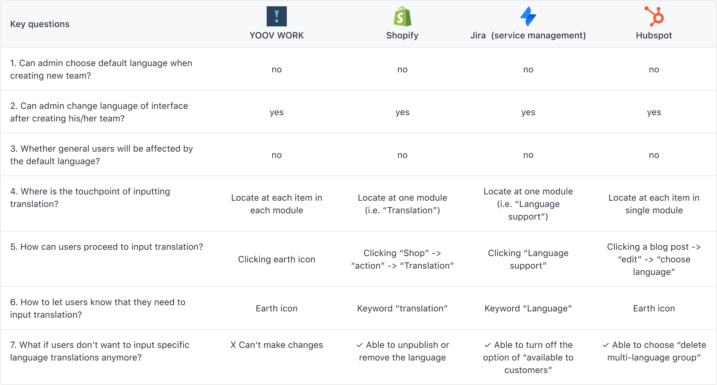
The key takeaways from this summary are:
- The touchpoints for language setting need to be centralized.
- Language settings UI should be more intuitive
- There is a lack of flexibility to enable / disable alternative language and add/ delete new languages
3. Requirement
Based on research results, a more specific goals for language settings are summarized as follows:
- The touchpoints for language setting should be to be centralize
- The UI design should be more intuitive and clear
- The system should provide touchpoints for enabling / disabling languages
- Users should able to access the function easily
- The UI design should provide room for more languages developed in the future
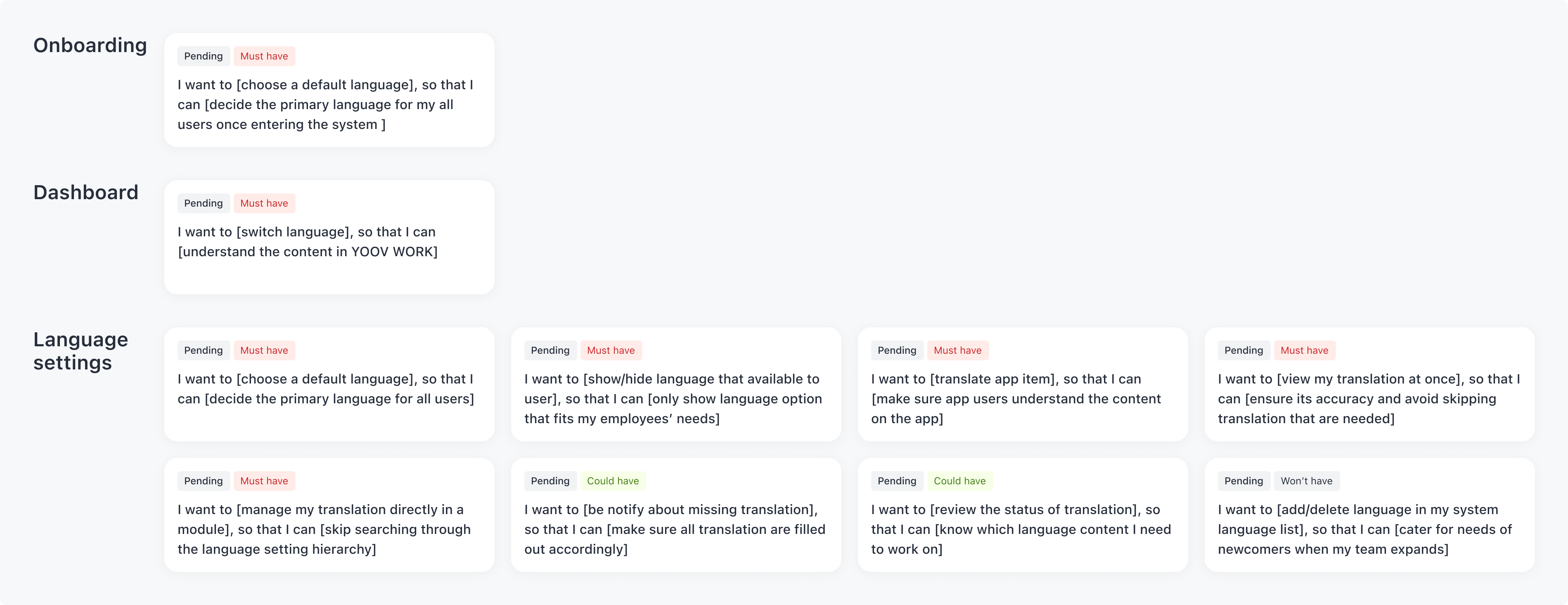
I also listed out user stories for clarifying the product requirements and communicating with product team.
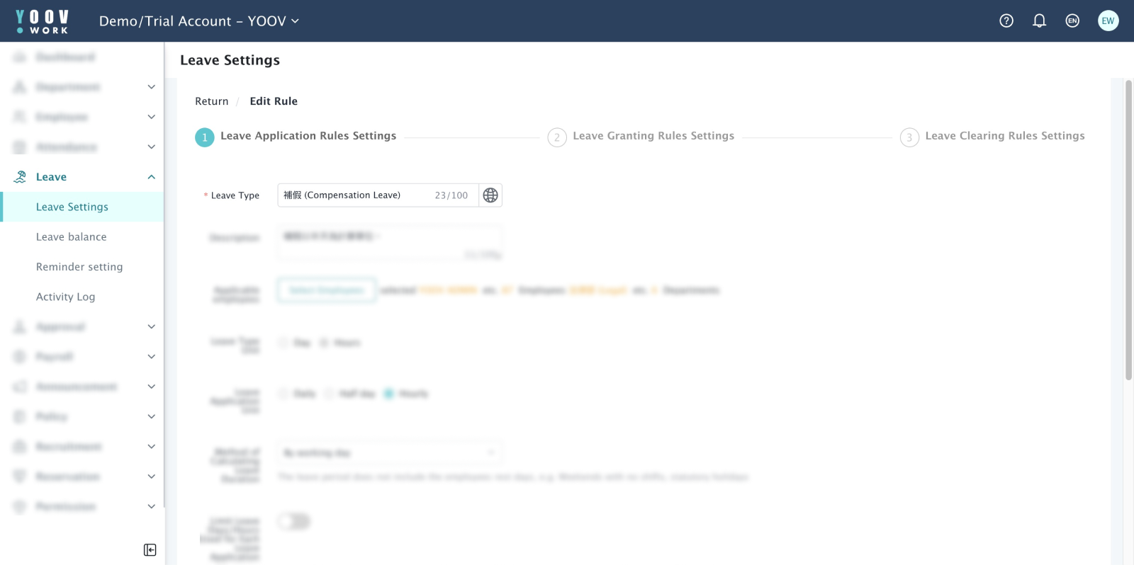
4. Current language settings
To come up with the most suitable solution for language settings, I need to understand the current YOOV WORK language settings.
First, I need to know which section of YOOV WORK need to be considered, so I listed out sections in 2 categories:
- YOOV WORK webapp that currently can input translation
- YOOV WORK webapp that cannot input translation, but should have provided
Then, I classified them based on their UI design into 2 categories:
- Editing form
- Editing text
The key takeaways from this summary are:
- The touchpoints for language setting need to be centralized.
- Language settings UI should be more intuitive
- There is a lack of flexibility to enable / disable alternative language and add/ delete new languages
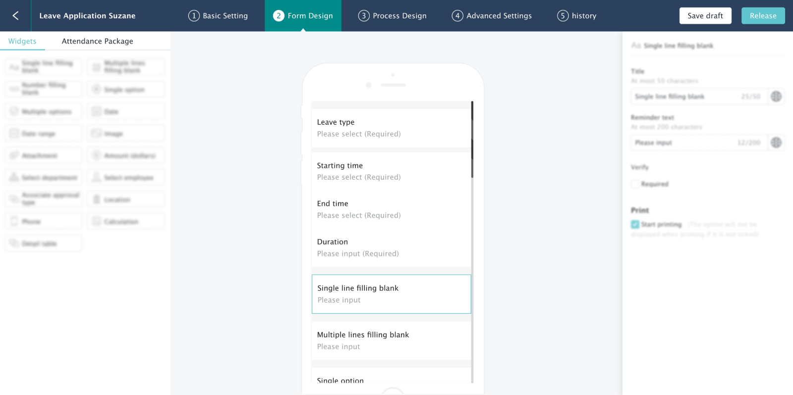
After adjusting the strategy, it ended up having 4 types of UI designs:
1. Editing form with dynamic widgets
2. Pure text
3.Rich text
4. Editing form with preset fields
5. Suitable approaches in wireframe
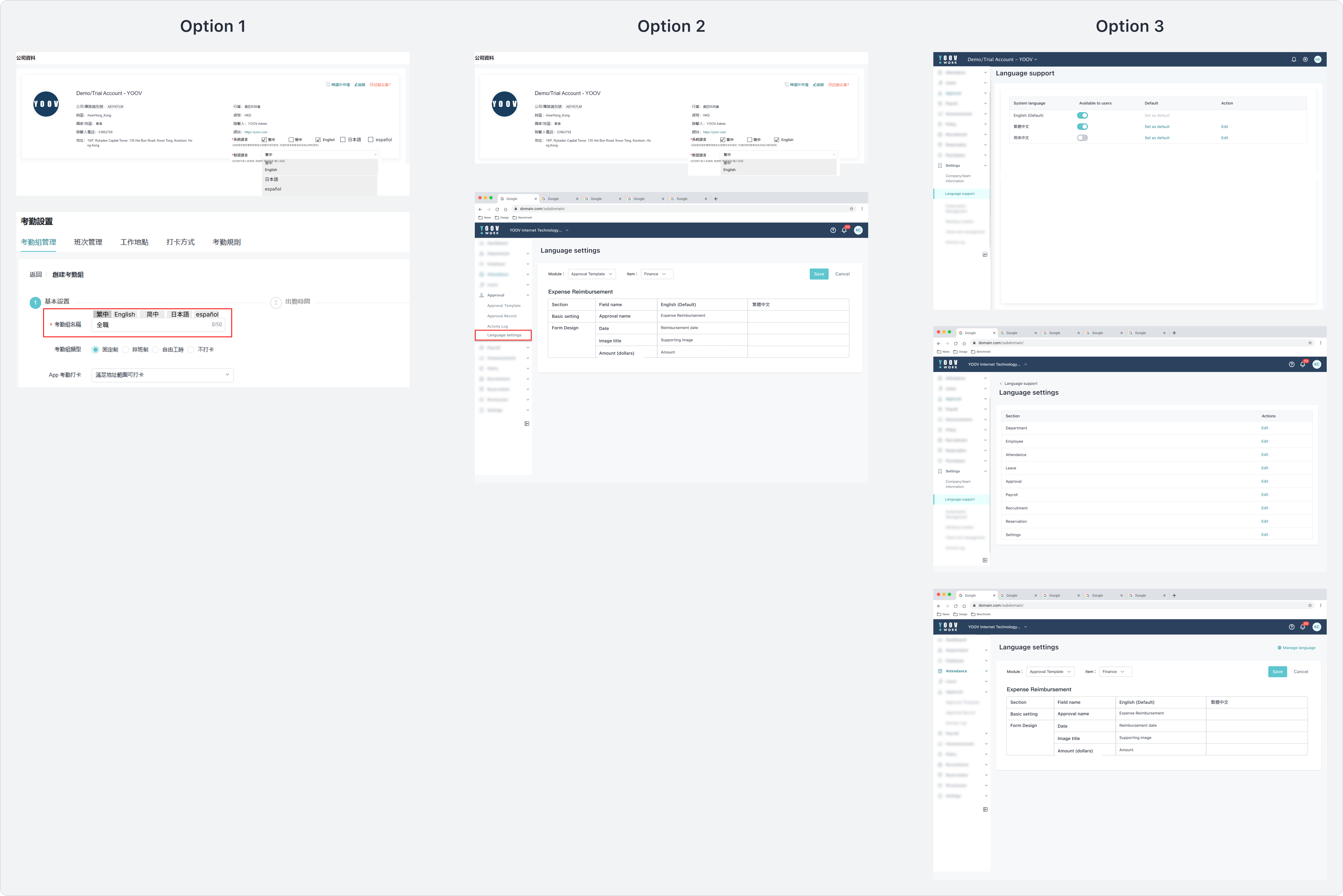
The entire function should include 2 parts: general settings and translation content. General setting provides settings for default language while translation content provides inputting content for multiple languages.
I have come up with three approaches:
- Option 1: Placing general language setting in “Company information” section, enhancing translation UI design by changing earth icon into tabs;
- Option 2: Placing general language setting in “Company information” section, adding translation section for each module and named as “language settings”;
- Option 3: Adding new section “language setting” in “Settings” which groups general settings and translation content.
These 3 approaches are compared by answering the goals listed in Section 3: Requirement
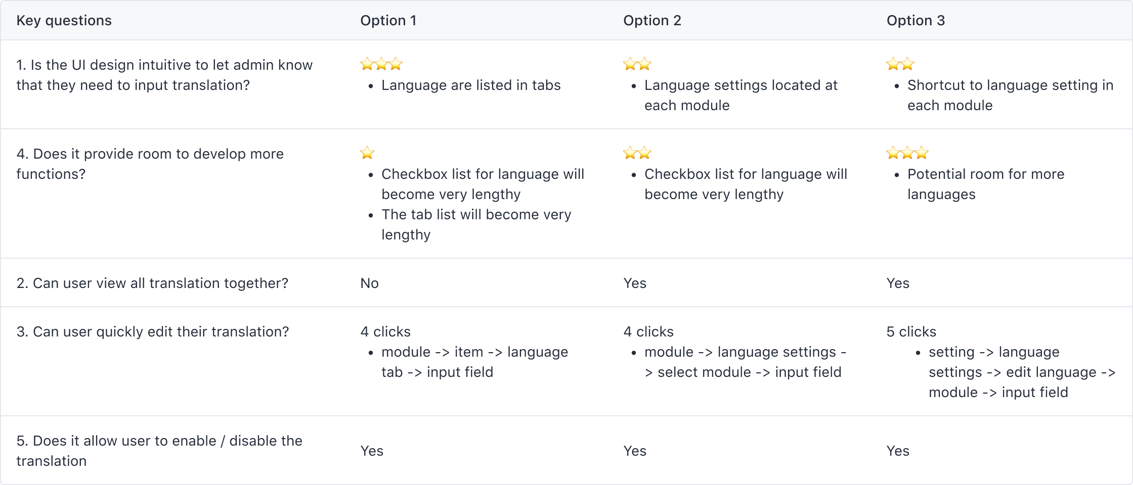
Based on the comparison, option 3 is chosen as the most suitable solution. It is moderately intuitive and perfect for future development. Though it has a relatively more number of clicks to access language settings, it can be reduced by combining the language page and module page.
6. Mockups
Among the 4 types of UI designs mentioned in Section 4: Current language settings, I decided to build mockups for most complicated one - Type 1: Editing form with dynamic widgets. This allowed me to reuse and simplify the mockup when applying it to the remaining 3 types of UI design.
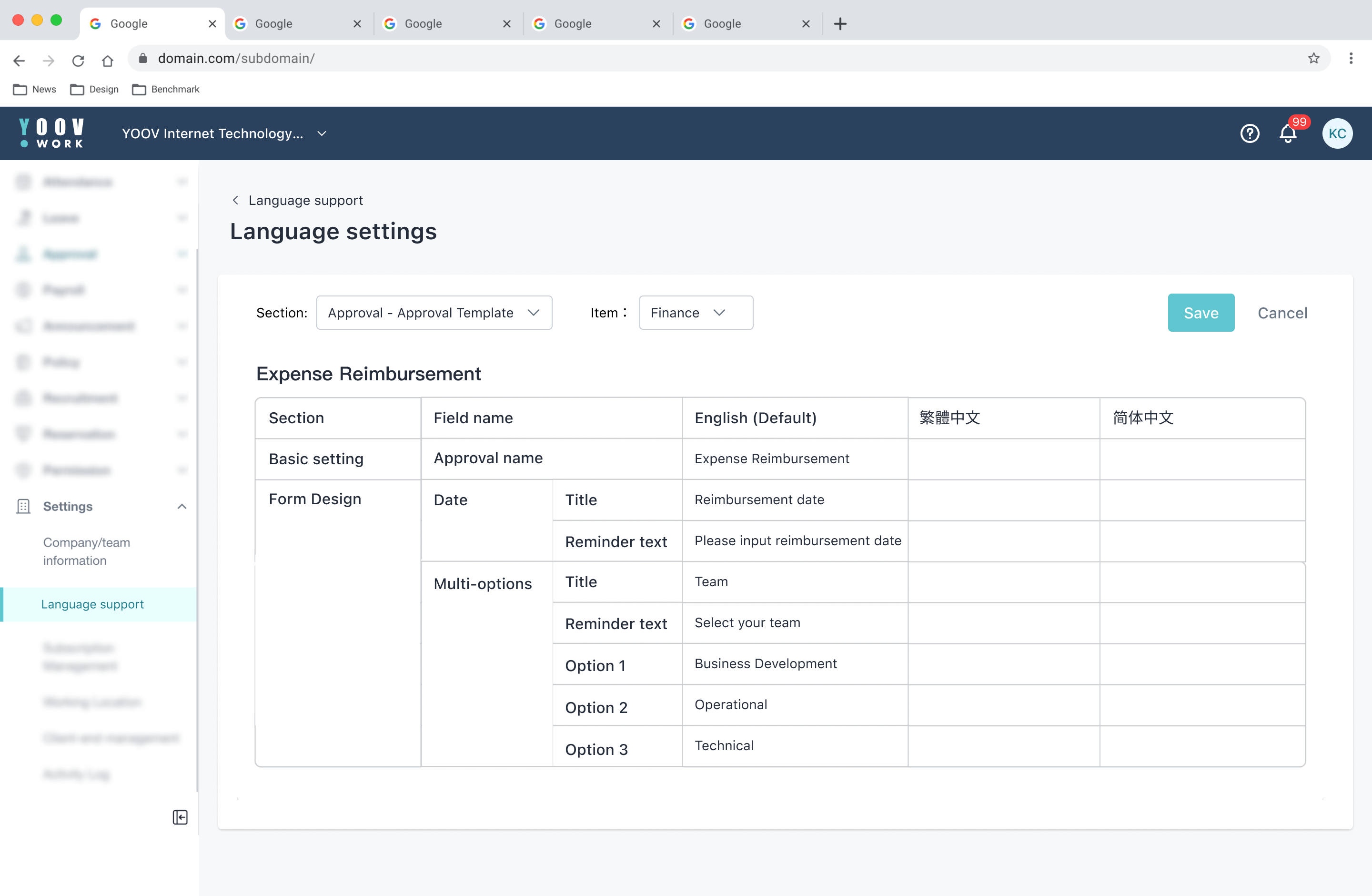
Table format
At first, I decided to simply use table format so that users can enter translations for each language side-by-side. The problem with this design is that it is full of text and not straightforward enough. Users were unable to relate themselves to which section of translation they were editing on the app version.
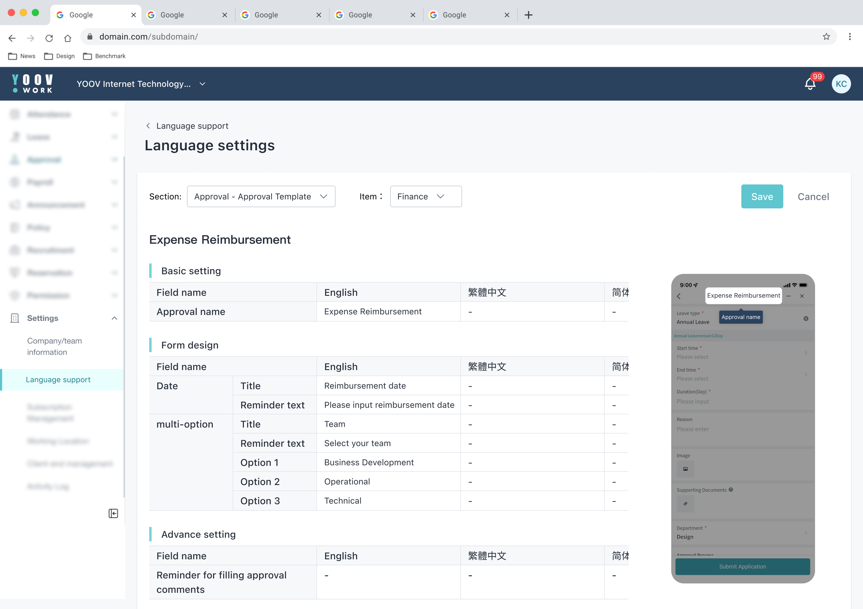
Realistic thumbnail section
Thus, I decided to incorporate a realistic thumbnail section. When users click on a table field, the thumbnail section highlights the section they are currently editing with an overlay. The problem with this design is that it could involve many types of thumbnails. The “Approval Template” module alone might require 15 screens, it could be up to 30 thumbnails for the whole YOOV WORK system. This solution is time-consuming, and could increase load on the system with its dynamic content. Using generic thumbnail have same issue of having many types of thumbnails.
7. Final mockups
To reduce loads on the system and simplify the design, the 4 types of UI design is using different strategies:
General settings

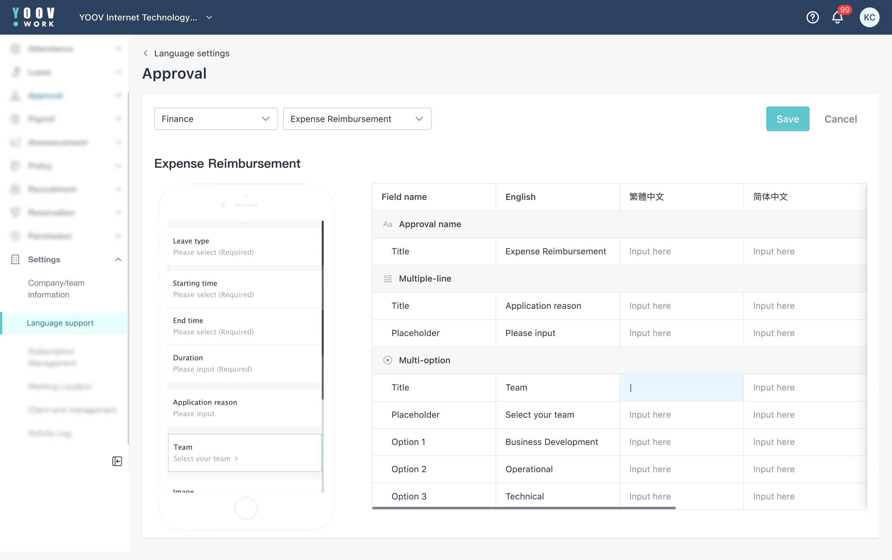
Type 1-Editing form with dynamic widgets
Reusing current component and highlighting editing field. Engineering team can reuse the components from current library. No thumbnail is needed. This save more time and simplify the design. User can understand easily as they have experience editing the section.
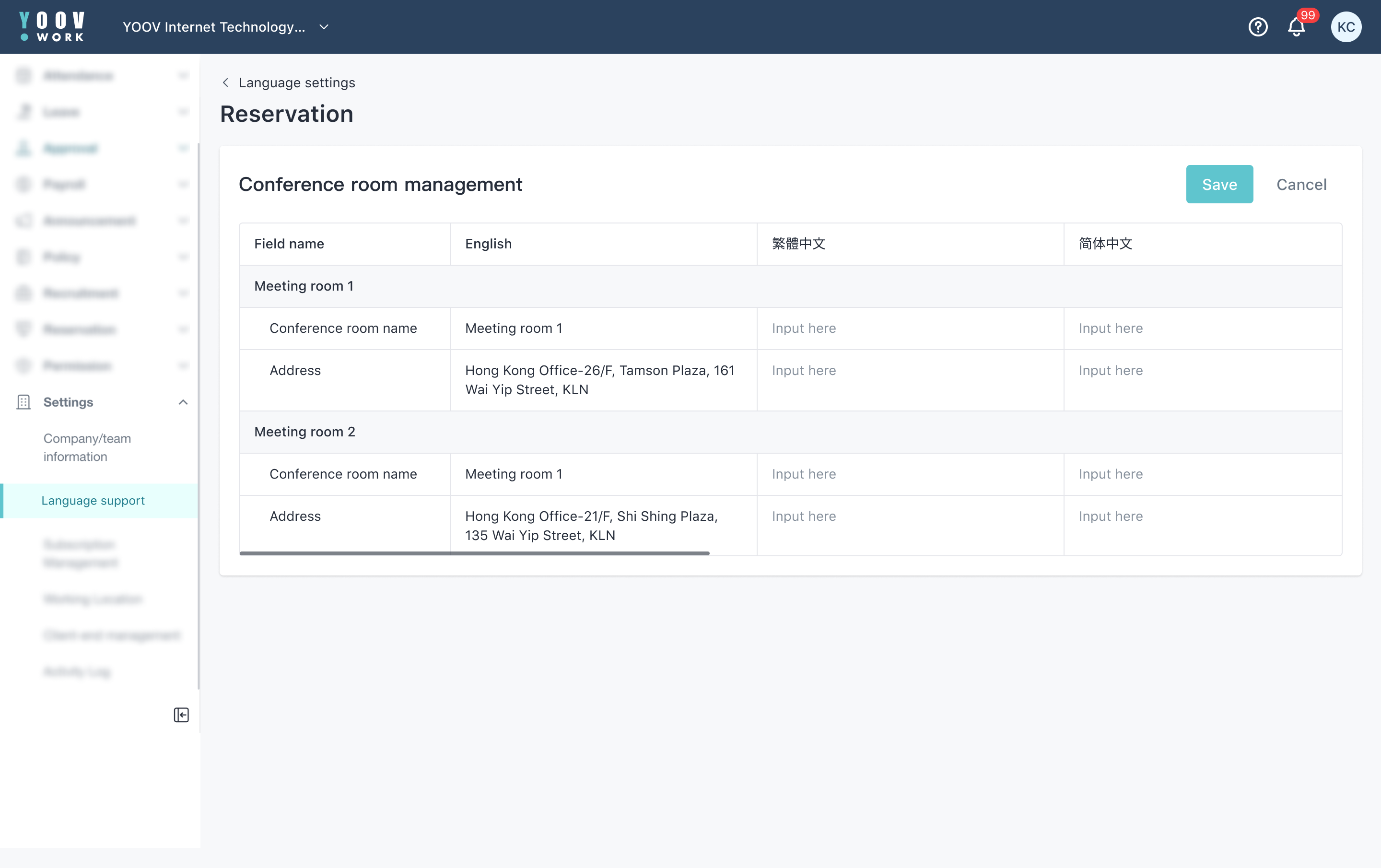
Type 2-Pure text
Using pure table format. It had been previously considered putting generic thumbnail, but this gives little value to users as they only translate text.
Type 3-Rich text
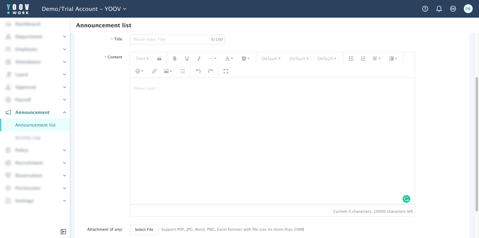
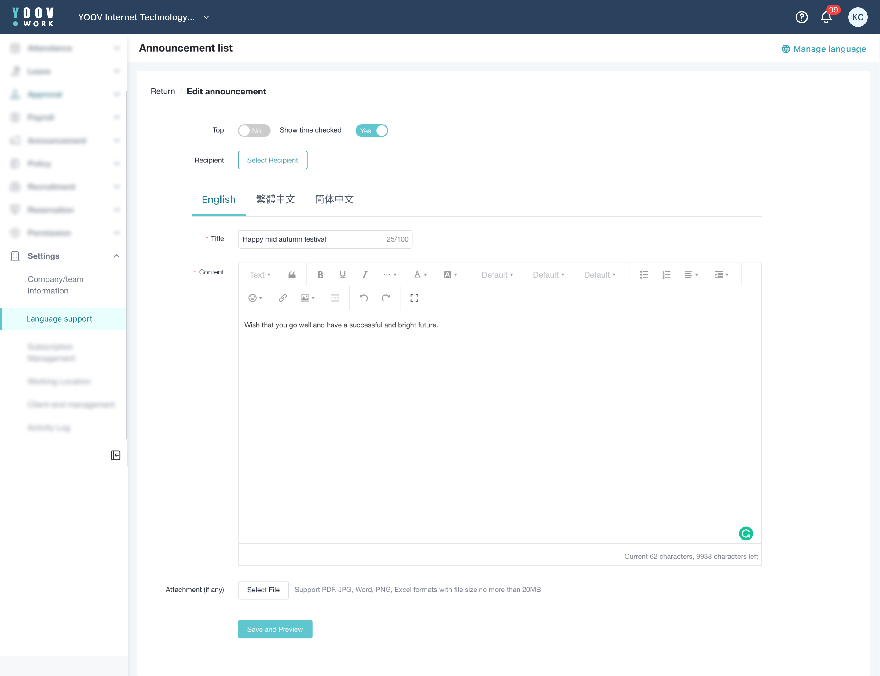
Redirecting users back to rich text edit mode while adding multiple tabs for selecting a specific language. Translation of multimedia content is hard to present in simple text field.
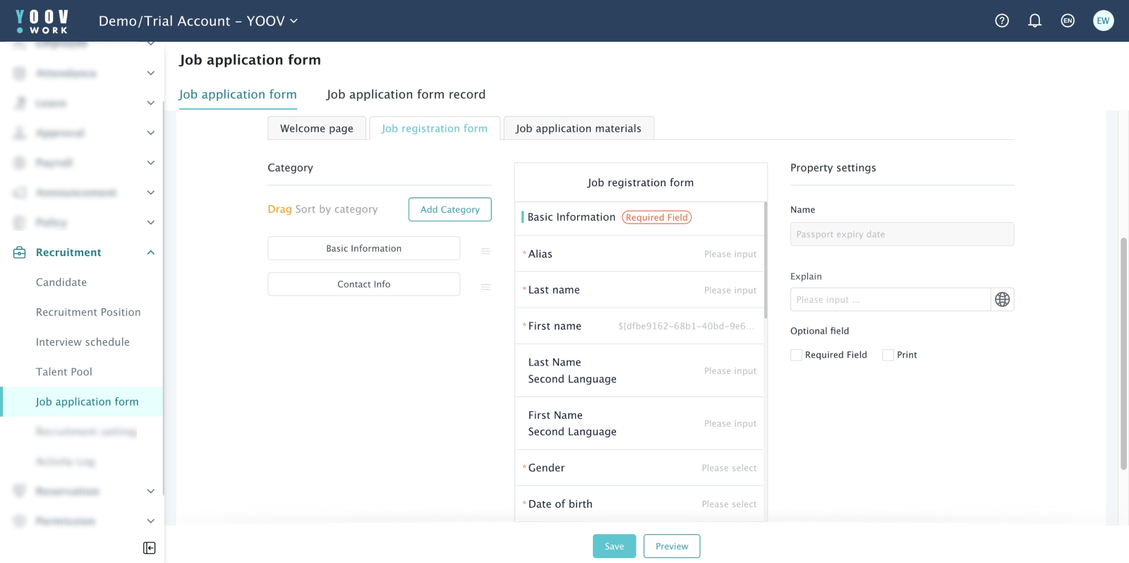
Type 4-Editing form with preset fields
Reusing current component and highlighting editing field. Engineering team can reuse the components from current library. No thumbnail is needed. This save more time and simplify the design.
Impact
- More efficient workflow for admin users
~ 50% time saved in their workflow - More consistent language content
Over 90% of the content on app version are in 1 language - Cater to more clients with various backgrounds of employees
More user-friendly to potential multi-national enterprises - Increase clients’ satisfaction with the product
Less confusion over the mixed language content
Future
- More types of UI design
As YOOV WORK continues to develop and upgrade based on user feedback and product roadmap, more features are introduced. Additional UI types might need to cater to these changes. - More languages will be provided
As YOOV continue to expand businesses to other Asia area, the system will be available and ready for clients like multi-national enterprises. The UI design won’t change much except translation content table will have columns to store these extra languages.


