Brief
Redress, a Hong Kong based environmental charity, seek for a redesign of its LEARN platform with the aim of provide both fashion designers and educators resources in circular fashion in an accessible, user-friendly and understandable way under the framework of Squarespace.
Therefore, our team help to conduct UX audit on their LEARN platform (Designer Space with learning materials; Educator Space with teaching materials - educator packs).
Initial Observation
Consistency
- Style of buttons is inconsistent
Usability
- Large thumbnails require more scrolling
- Assume common call-to-action to be located at thumbnail
Research
Usability Test & Interview
Though having few initial pain-points identified, we want validated insights from targeted audience. Hence, we invited 5 designers and 6 educators to join our usability test and interview sessions.
The task was to have them show us their browsing journey and habit on the platform which enable us to:
- Understand designers learning experience of sustainable topic
- Understand educators teaching experience of sustainable topic
- Understand users’ preference and suggestion
- Identify pain-points and opportunities of our subsequently developed low-fidelity wireframe
- Identify pain-points and opportunities of using the original website, especially aspects related to four main goals
Insights and Findings
With all the insights collected from our interviews, we organised them using affinity map which emphasise the major pain points of the LEARN platform. Here are four of the pain points that are frequently raised out by the interviewees:
1
Unattractive introduction of circular fashion system
Users potentially or unconsciously skip the youtube section
2
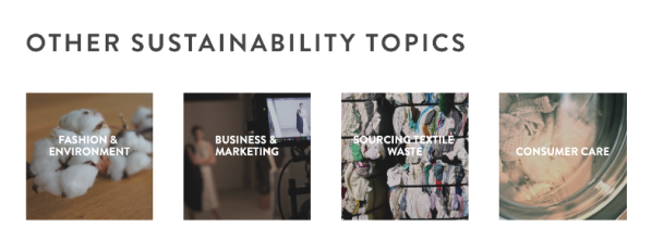
Arrangement issue of existing content
Users are unaware of the materials at “Other Sustainability Topics” when putting the section after “4 Core Design Strategies”
3
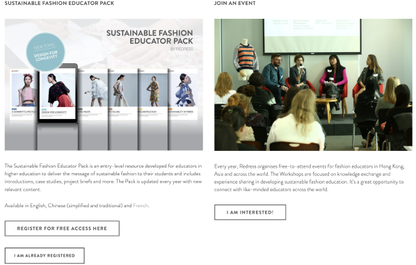
Unclear introduction of educator content
Users are reluctant to register and provide personal information without fully understand the content of educator packs and events
4
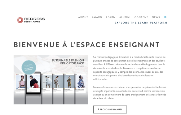
Hidden materials in alternative languages
Users who understand bilingual are unaware of the available materials in alternative languages (French and Russian)
Consolidating Insights
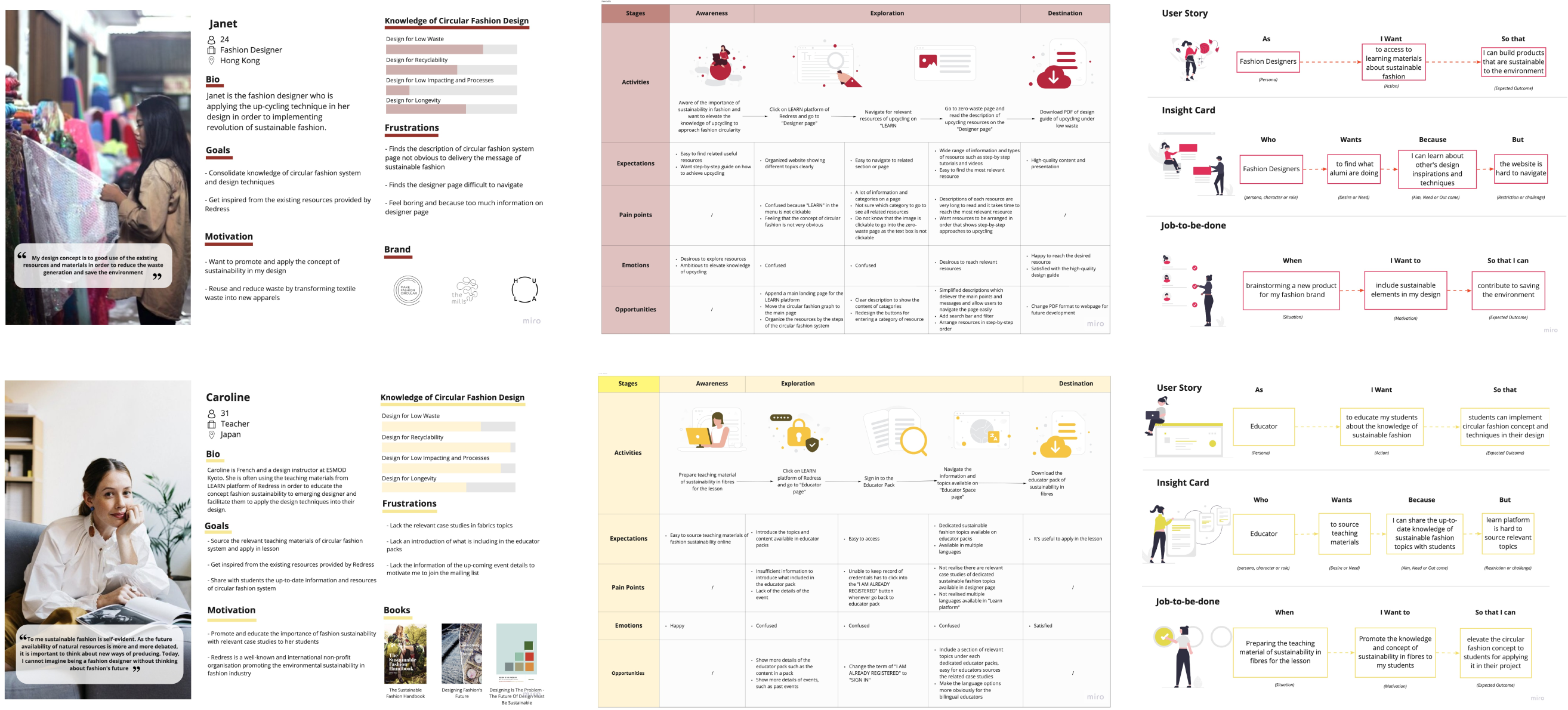
We summarise the insights about the needs and frustration of fashion designers and educators with use of personas, user journey map and Jobs-to-be-done framework. This helps to present users' situation to the client easily. The major insights we learnt about fashion designers and educators are:
Fashion designers wants to get design learning materials because they can learn about other's design inspirations and techniques but the website is confusing to navigate.
Educator wants to to get teaching materials because I can share the up-to-date knowledge of sustainable fashion topics with students but the website is hard to source relevant topics
Ideate
Site Map & Task Flow
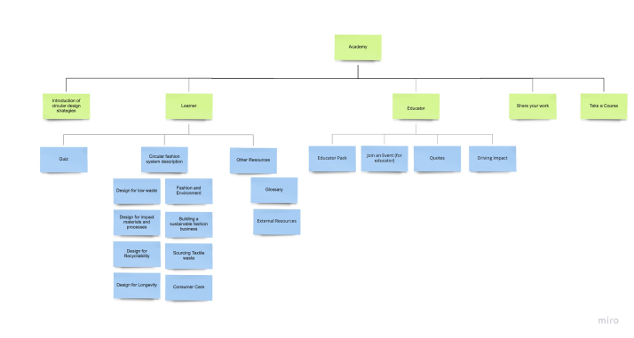
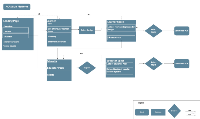
Before creating our first minimum viable product, we want to illustrate and propose a new site architecture under which a user journey of completing a specific task. From there we can reorganise the content more easily in a way that make sense to the users.
Proposed Site Map
Proposed Task Flow
First Version of minimum viable products
Based on the insight collected from our usability test, and the proposed structure of LEARN platform, we came up with our first version of minimum viable products.
Prototyping and Validation
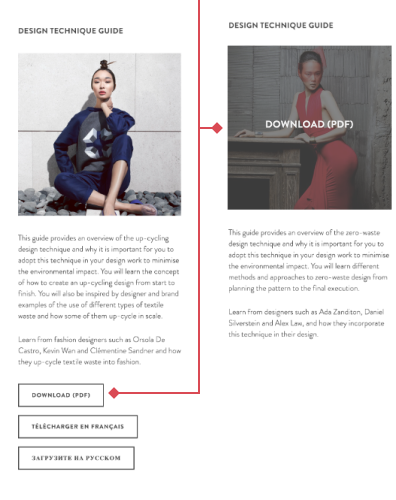
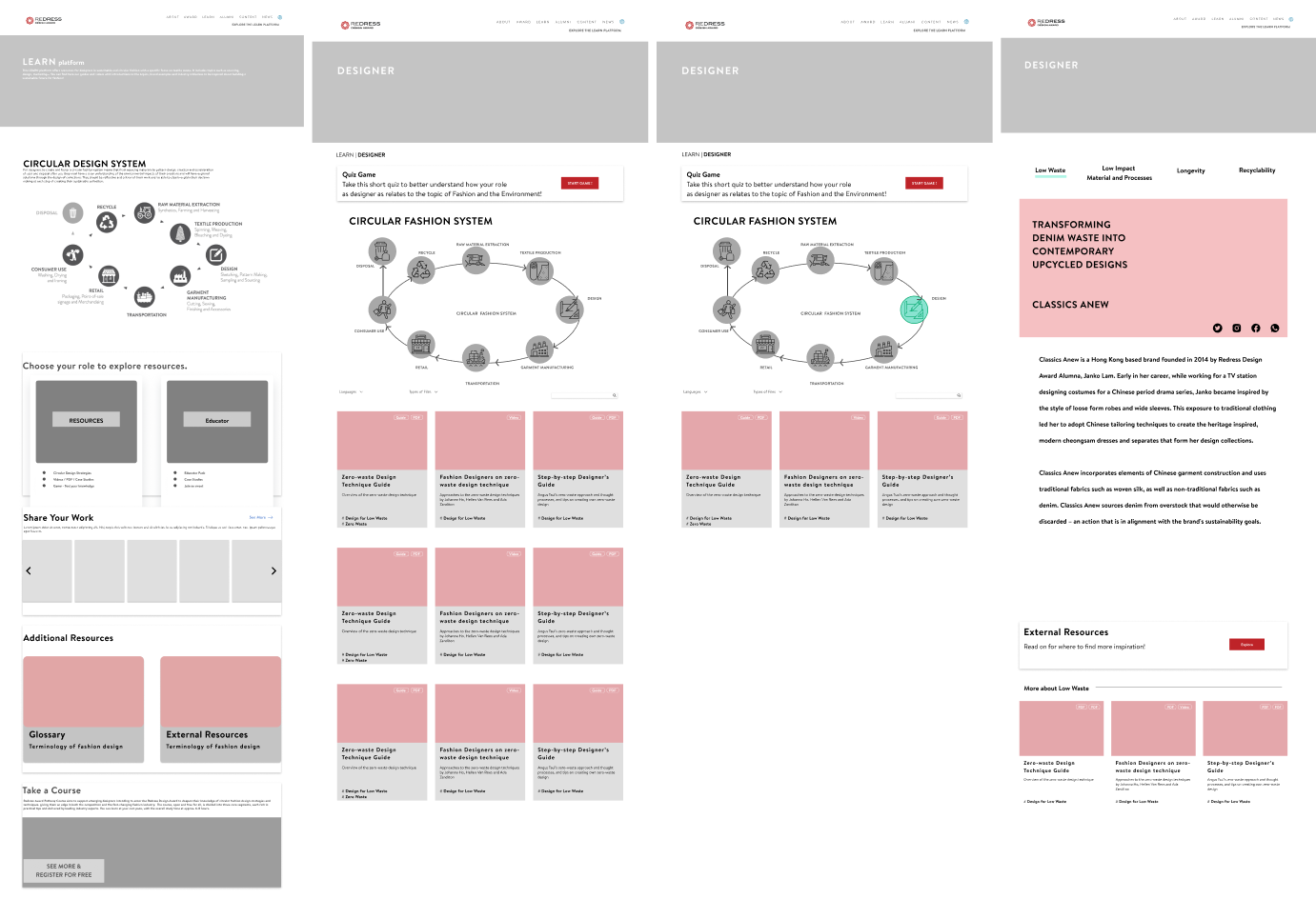
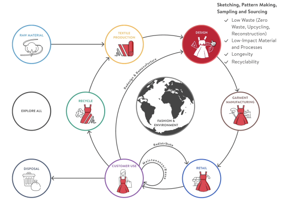
Unattractive introduction of circular fashion system
Users potentially or unconsciously skip the youtube section
Before
- Holistic, descriptive and engaging
- Users reveals that descriptions of each step might be distracting. It makes the concept hard to understand.
After
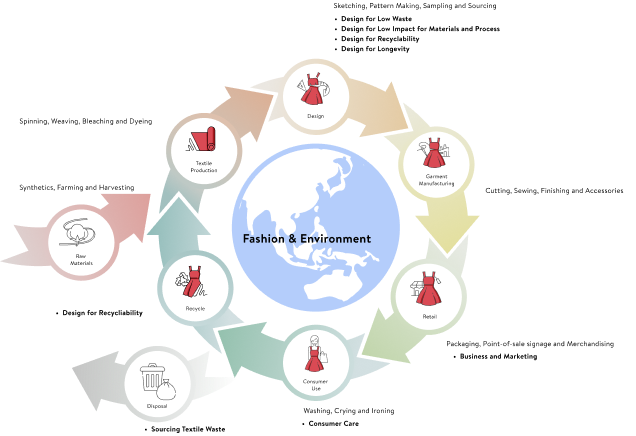
- More emphasis on the importance of Redesign, Remanufacture, Redistribute and Reuse in the supply chain based on the butterfly model
- Incorporating a simple version of infographic
- Following to the hovering effect, it would then require CSS input under the system of Squarespace
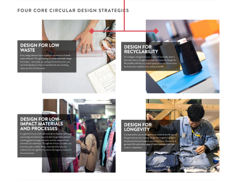
1
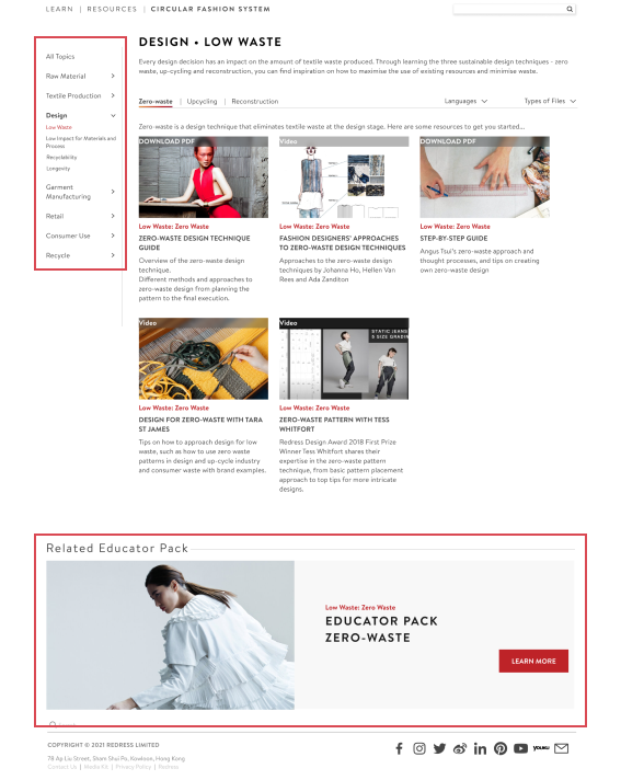
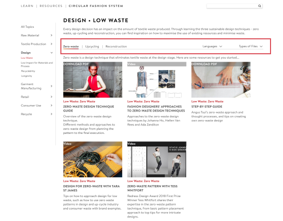
Arrangement issue of existing content
Target: Grouping existing “Other Sustainability Topics” section with existing learning materials into a new section called “Resources”
Before
- Users access case studies more easily that duplicated from “Educator Space
- Users presuming the section "Resources" also include teaching materials
- Users think that navigation to educator pack looks like an advertisement
- Users think that the content on the left column have vague relationship between the infographic and selected topic
- Users navigate between designer page and educator in a logic way
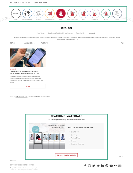
After
- The section called "Learner" instead of "Resources"
- Incorporating a simple version of infographic
- Bottom section title changed from "Related Educator Pack" to "Teaching Materials"
- Incorporating list of features that prompts users about the existing teaching materials at educator space
2
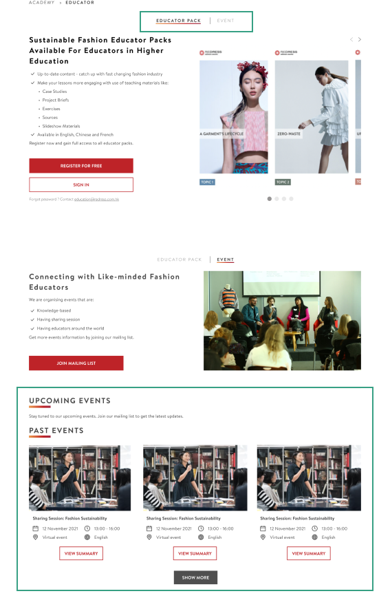
Unclear introduction of educator content
Target: Including a brief introduction of educator packs and events that attract registration from educators
Before
- Users get confused with the tab bar at the top that representing the titles of lower section (Left column represent Educator Packs while right column represents Events)
- Users found the page having too much text
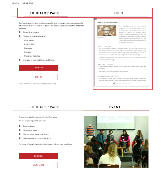
After
- Shortening the tab bar that distinguish section between bottom content
- Incorporating topics and cover page of each educator pack to give users better understanding on the content without text-based preview
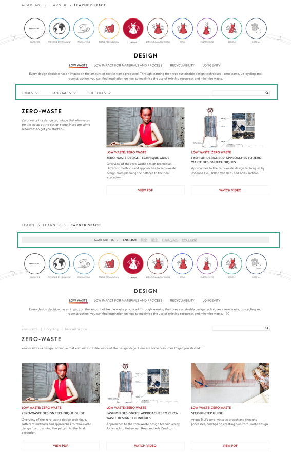
3
Hidden materials in alternative languages
Target: Highlighting the availability of materials in alternative languages (French and Russian)
Before
- Users are unaware of the available materials in alternative languages (French and Russian)
- Though filter function is provided in Squarespace, filter function is not compatible with quick navigation in the system of Squarespace. Therefore, our first proposal would be infeasible.
After
- Using filter function to also achieve the same purpose as quick navigation – displaying topics users selected
- Alternative solution: Having a banner with buttons that prompting about the presence of materials in alternative materials, while keeping quick navigation bar down below.
4
Final Prototype
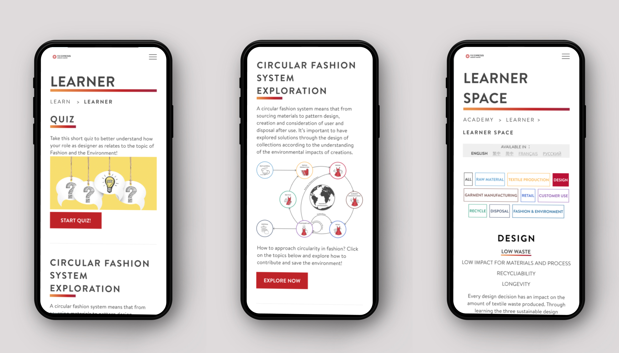
Mobile Version
Takeaway
Having a chance to redesign a comprehensive and holistic website made me learnt a lot.
Here are some of the takeaways from this projects:
Make use of CSS effects. This helps to showcase a simple and easily understood infographic incorporated complexed concept.
Bring value by usability test. Users’ feedback are the most valuable information that inspire our design as they are the fundamental user of the website.
Involve web development input. This helps to make sure that our proposals are feasible as knowing the technical limitations in advance lessen chance of reworking.
Communication with clients. Communicating the findings of research help the client better understand the rationale behind our design.
We are glad that the client likes our designs, and decided to offer us paid internships to implement the project. Getting to work with web development was also a precious and great learning experience for us to get to know the development process of a website.


